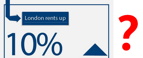
Are London rents up 10%?
Renting in London isn't cheap.
So is it getting 10% more expensive every year? That's what Labour have been saying on Facebook, Twitter and on voters' doorsteps.
But the figures it's based on can't be used for a year-on-year comparison, and the better alternatives suggest it's a much lower increase.
Going private
We got in touch with Labour who told us the 10% rise comes from a comparison of private rent estimates from the Valuation Office Agency (VOA), alongside earnings data from the Annual Survey for Hours and Earnings.
So the 10% actually refers to private renting, though this isn't made clear in the infographic. About a quarter (24%) of households in London rent from a private landlord. Another 23% rent from their local authority or Housing Association, although there aren't up-to-date figures for the change in these rents London-wide.
But accurate year-on-year comparisons can't be made using the VOA figures because the sample of data from landlords isn't consistent between years. The mix of bedroom sizes changes, as does the geographical mix. The VOA itself warns that:
"the composition of the sample [used to produce rental data] varies over time and therefore caution is advised when drawing comparisons between the statistics reported in the period reported in this release and those for different time periods due to those variations."
The Office for National Statistics also confirmed to us this was the case, and directed us towards its own Index of Private Housing Rental Prices, as an alternative. This draws figures from the VOA but are purpose-built for year-on-year analyses, although the data is described as 'experimental', meaning it isn't necessarily perfectly robust either.
The latest figures from the ONS showed London rents in the private sector rose by 1.6% between 2012 and 2013.
As with house prices, there's also alternative data compiled by private sector firms. LSL Property Services publishes a regular index of rental prices in London and elsewhere, using its own sample of properties renting using its services. It found a 4% increase in rental prices paid between 2012 and 2013. HomeLet compiles another, showing a 3% annual increase since last year.
This isn't to say the VOA data is worthless for comparisons across time. Research by Shelter for instance used the same figures for comparison between 2011 and 2012, but adjusted the figures to account for bedroom numbers and geography. It found a 5% rise in London that year, equivalent to an extra £14.25 a week.
So most of the indicators suggest 10% is an exaggerated figure for London's private rental market, and we'll be asking Labour to use more comparable figures for their rental claims.
