What we know, and what we don’t, about the true coronavirus death toll
Even if we had never heard of Covid-19, it would have been obvious by early April that something terrible was happening in the UK.
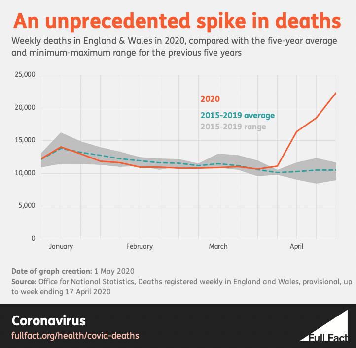
In the fourteenth week of 2020, which ended on Friday 3 April, a total of 16,387 deaths from all causes were registered in England and Wales. According to the Office for National Statistics (ONS), which published the data, it was the most registered in any week since January 2000.
Week 15 was higher still, with 18,516 deaths registered. When the figures were published for Week 16 on Tuesday, the number was 22,351, the most ever recorded since comparable figures began in 1993.
It’s not necessarily unusual for this kind of national data to break records. The UK has a rising population, which means that we’ll often see historically high numbers of people in education, say, or in employment. But this record was not like that. These deaths occurred in a sudden spike at an unusual time, when the winter and the flu season were all but over.
In Week 14, the total was 6,082 deaths (or 59%) above the average for that week of the year. Week 15’s total was 7,996 (76%) above average. In Week 16, it was 11,854 above, or 113%—more than twice as many people dying, in total, than you’d normally expect. These above-average numbers are often known as “excess deaths”. The figures for spring 2020 are unprecedented.

Statistics can sometimes hide the human story that they try to tell, but the scale of this disaster would be invisible without them. More “extra” people were registered dead in those three spring weeks than died on Britain’s roads, in total, over the past 12 years.
How many people have really died from Covid-19?
Since the outbreak started, you have probably heard a death toll mentioned in the media each day. Until recently, it told us how many more people had died in hospitals after a positive test. The government has now added the number of deaths after a positive test in other locations. Some people call this number “the official death toll”. Even Public Health England labels its measure “the total number of deaths”.
You may also have heard that this is not the real total. It still includes almost nobody who died from Covid-19 without testing positive at some point. It doesn’t include anyone who died from something else, because they were unable or unwilling to get medical care during a pandemic. It doesn’t include people who may have died as a result of domestic violence, or suicide, or other possible social consequences of the lockdown.
On the other hand, you may have heard that some of the people who died “with” Covid-19 did not actually die “from” it, which is true, at least according to the death certificates. Analysis by the ONS found that 14% of the death certificates mentioning “Covid-19” in March did not list the disease itself as the “underlying cause of death”. It also found that deaths from ischaemic heart disease—commonly one of the biggest killers in the UK—were 26% below the average for the month. That could mean that Covid-19 killed some people who were already close to death, but it could also mean that some heart disease deaths were being attributed to Covid-19 incorrectly.
These are not petty political points. How many people are dying, and why, are the most urgent and important questions of the pandemic. Yet when we discuss them we still have to say “may” and “could”, because we don’t yet know the truth exactly.
If you want to see whether the epidemic is growing or shrinking—the epidemic’s shape—then the daily “official” figures, when arranged by the actual date of death, give a blurred but reasonable outline of the recent days, albeit one that can only tell you about infections that happened weeks before.
But if you want to know the epidemic’s size, you have to look at how many people have died in total—what’s known as the “all-cause mortality”. This comes from the ONS, the National Records of Scotland and the Northern Ireland Statistics and Research Agency. It takes about two weeks for each death to be registered and processed before it appears in the data, but every Covid-19 death, and every other death, will be in there somewhere.
What we know, and what we don’t
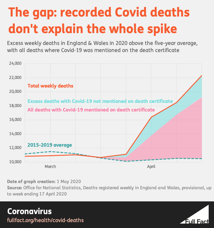
However, even this total number leaves us with a mystery—the same mystery in all four nations. Looking just at the figures for England and Wales, if you remember, 16,387 deaths were registered in Week 14 of 2020, 18,516 in Week 15, and 22,351 in Week 16. These represented 6,082, 7,996 and 11,854 more deaths than you would expect in those weeks of an average year. Of course in an average year there isn’t a Covid-19 pandemic, so it would be reasonable to guess that it was the sole cause of 2020’s extra deaths. And yet, according to the figures, it isn’t.
In those three weeks, just 3,475, 6,213 and 8,758 death certificates mentioned Covid-19. This still leaves 2,607, 1,783 and 3,096 “extra” people dying. Not of—or even “with”—Covid-19, but seemingly for some other reason. This is the gap in our knowledge where many of the answers to our questions about the “true” death toll will lie. 
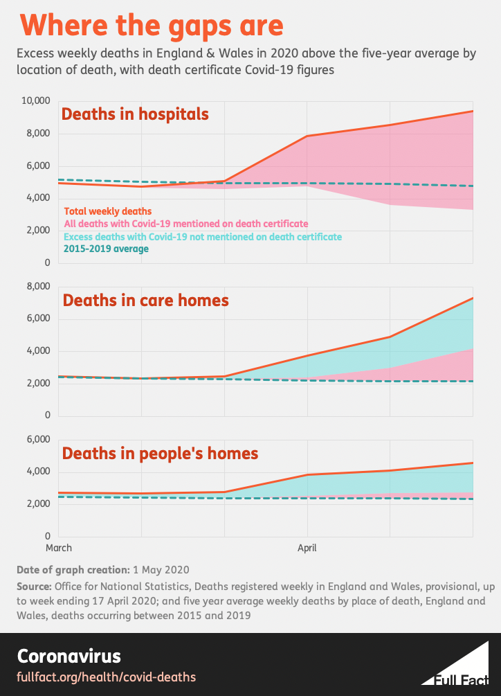
There is a clue in the data on where people died—because when you look only at deaths in hospitals, there is no gap. There, deaths were well above average in all three weeks, but deaths with Covid-19 were enough on their own to explain the whole rise. In fact, they were more than enough: if you remove the Covid-19 deaths, the number of people who died in hospitals from other causes was actually lower than the average during those weeks.
It’s when you look at deaths in care homes, and in people’s own homes, that the gap returns: both figures also rose significantly, but their recorded Covid-19 deaths didn’t even account for half the extra numbers.

The most obvious guess is the simplest: that all those unexplained extra deaths in care homes and private residences are in fact Covid-19 deaths, and we’re undercounting the size of the epidemic. In this explanation, many more people outside hospitals did die from Covid-19, but the certifying doctor either didn’t realise, didn’t have enough evidence (perhaps because of a shortage of tests in early April), or didn’t have time to consider the cause of death properly. (Indeed, this was what a whistleblower told Channel 4 in a news report on 13 April.)
That straightforward answer may yet turn out to be the right one. But still, there are hints that this is not the full picture. For example, if under-reporting was the sole cause of the gaps, then you might expect the accuracy of death certificates to improve over time, as testing became more widely available and doctors became more knowledgeable about the disease – and more willing to mention it without a test, which they were free to do. As the weeks go by, you’d therefore see more of the excess outside hospitals being explained by Covid-19. But this hasn’t happened so far. In Week 16 in England and Wales, the non-Covid-19 share of the excess actually rose substantially compared with the week before.
In the same week, the ONS began to publish the number of Covid-19 deaths that care homes themselves reported to the Care Quality Commission. Yet this again showed too few Covid-19 deaths, even in the opinion of care home staff, to fully explain the huge rise in the deaths that was happening.
“That’s one of the things that struck me,” says David Spiegelhalter, Winton Professor of the Public Understanding of Risk at the University of Cambridge. “That actual death registrations in ONS closely matched what the CQC has heard from their much more informal reporting procedure made on the judgement of the people in the care home. This lends weight to the idea that a substantial part of the non-Covid excess deaths could be due to the unwillingness [to seek medical help].”
Carl Heneghan, Professor of Evidence-Based Medicine at Oxford University, agrees. “It would not seem in the current climate, by Week 16, that it would all be explained by under-reporting,” he says.
In the end, the mystery may have many partial explanations, which only together make up the whole. We’ve already seen that hospital deaths from causes besides Covid-19 were actually lower than average in April. This might suggest that some people who would have died in hospital for other reasons died at home instead, perhaps because of the efforts to make as much room in hospitals as possible, or because people did not want to go to hospital in the first place.
If you find this confusing, you are not alone. It is confusing. This is the kind of important question we can’t answer yet, even with the good data that we already have.
It’s not just the UK
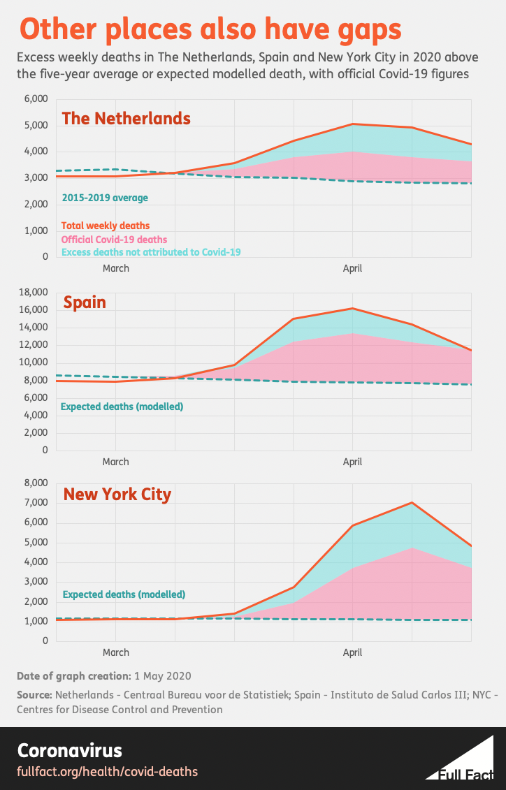
Whatever the cause of the parallel spikes in Covid-19 and other deaths, the same pattern appears in many countries. Data from the EuroMOMO project shows high excess mortality across much of western Europe in the first half of spring, with spikes in Belgium, France, Italy, the Netherlands, Spain, Sweden, Switzerland and the UK. Countries that appear to have smaller Covid-19 outbreaks, such as Austria, Denmark, Finland, Germany, Greece, Ireland and Norway, show very little rise, if any at all.
One analysis on April 13 found that the Netherlands has seen nothing like this spring for the past 25 years, yet most of the extra deaths are not confirmed Covid-19 cases. In the second half of March, according to El Pais, Madrid issued more than twice as many burial licences as it did in the whole of March last year, yet official figures say that nearly half of the extra deaths were not caused by Covid-19.
In the 31 days ending on 4 April 2020, a New York Times analysis of preliminary official figures found that the number of above-average deaths in New York was nearly double the number recorded in September 2001, when the World Trade Center was attacked. More than a third, apparently, had nothing to do with Covid-19. (The latest analysis finds about 4,200 deaths not associated with Covid-19 out of a 20,900 New York City excess, which is about a fifth.)
 Wuhan must have initially had a large number of extra non-Covid-19 deaths too, because its Covid-19 total was revised upwards by 50% on April 17. In countries with low levels of testing, spikes in overall mortality may be the first sign that a large outbreak is happening. In others, the lack of such a spike may provide a degree of reassurance that authorities are not missing a hidden epidemic. The New York Times, the Economist and the Financial Times now publish updated figures for excess deaths in multiple countries. The New York Times and the Economist show Jakarta, Indonesia with only 84 confirmed Covid-19 deaths in March, but 1,000 total excess burial licences (according to the New York Times) or 1,543 (according to the Economist).
The large excess in other deaths is one reason why we can’t reliably compare the confirmed Covid-19 death tolls around the world. In retrospect, the drooping curve charts that you may have seen in newspapers or in the government’s daily briefing can imply a more precise understanding of the outbreaks in different countries than we ever really had. (That is why the Financial Times, whose charts have become central to many people’s understanding of the epidemic, has recently switched its attention to excess mortality.)
“I feel the only unbiased comparison you could make between different countries is by looking at all-cause mortality,” says Professor Spiegelhalter. “There are so many questions about the rise we have seen in deaths that have not got Covid on the death certificate, yet we feel are inevitably linked in some way to this epidemic. Those are the figures that I would prefer to look at.”
The Deputy Chief Medical Officer, Jenny Harries, feels the same. “Probably the most useful statistic going forward to compare between countries would be all-cause mortality,” she said during the daily briefing on 19 April.
Who has it worst?
The figures now being published by different newspapers make it possible to see the terrible waves of mortality hitting different countries. These are the curves that the world began to talk about flattening in February, and there will be lessons in them that every country can learn. But they are not enough on their own to measure our success, let alone compare it with our neighbours. “To create crude country comparisons – who’s slightly bigger, who’s slightly less – I would see as not helpful at the current time,” says Professor Heneghan.
After all, it is true that the death toll will vary according to how well the disease is managed and treated from place to place, but also according to the quality and methods of the local data, the age and health of the populations, perhaps their genetic susceptibility, perhaps the weather, cultural and lifestyle factors, population densities, levels of air pollution, maybe even local differences that emerge in the virus itself. Nor has the pandemic even finished yet. And even then, there may still be some severe effects on public health to come.
Besides all this, there may always be other factors that you would not at first consider. The Financial Times does not publish excess mortality data for Istanbul, for example, because it believes that burials there are higher than average at least partly because people’s bodies are no longer being taken away for burial in their home towns. It can be difficult to live with so much uncertainty, but until we know the answers, uncertainty is the truth.
“To understand what’s happened here,” says Professor Heneghan, talking about the UK, “you’d have to ascertain the deaths. So you get the death certificate, but you’d also need to have the medical notes to hand, and coroners’ reports... That is actually a large job. A very big research study.” Still, he thinks it must be done. “I do think what we’re witnessing is unprecedented, in my 26 years in healthcare and epidemiology. And I think we do need to do that, to really understand what’s happened, and hopefully learn to say what we would do differently next time, if we ever end up in a situation like this.”
Professor Spiegelhalter believes that the UK will eventually have “a good idea of how many have died because of the epidemic and the measures taken”. And whether the UK’s outbreak will prove to be the worst in Europe? “Ask me in December.”
With thanks to Anthony Masters, Statistical Ambassador at the Royal Statistical Society, for his assistance. Charts by Tom Phillips.
Hear us talk through this fact check on our weekly podcast.
Listen